
Branding
2 September 2026 · 5 min read
The Medical Wellness Industry Has a Branding Problem. Here's What It Is.
Lisa
Digital Marketing Specialist at Stackdbase
Every IV drip clinic looks the same. Teal, white, drip icon. Here's how to stand out without losing your professional edge.
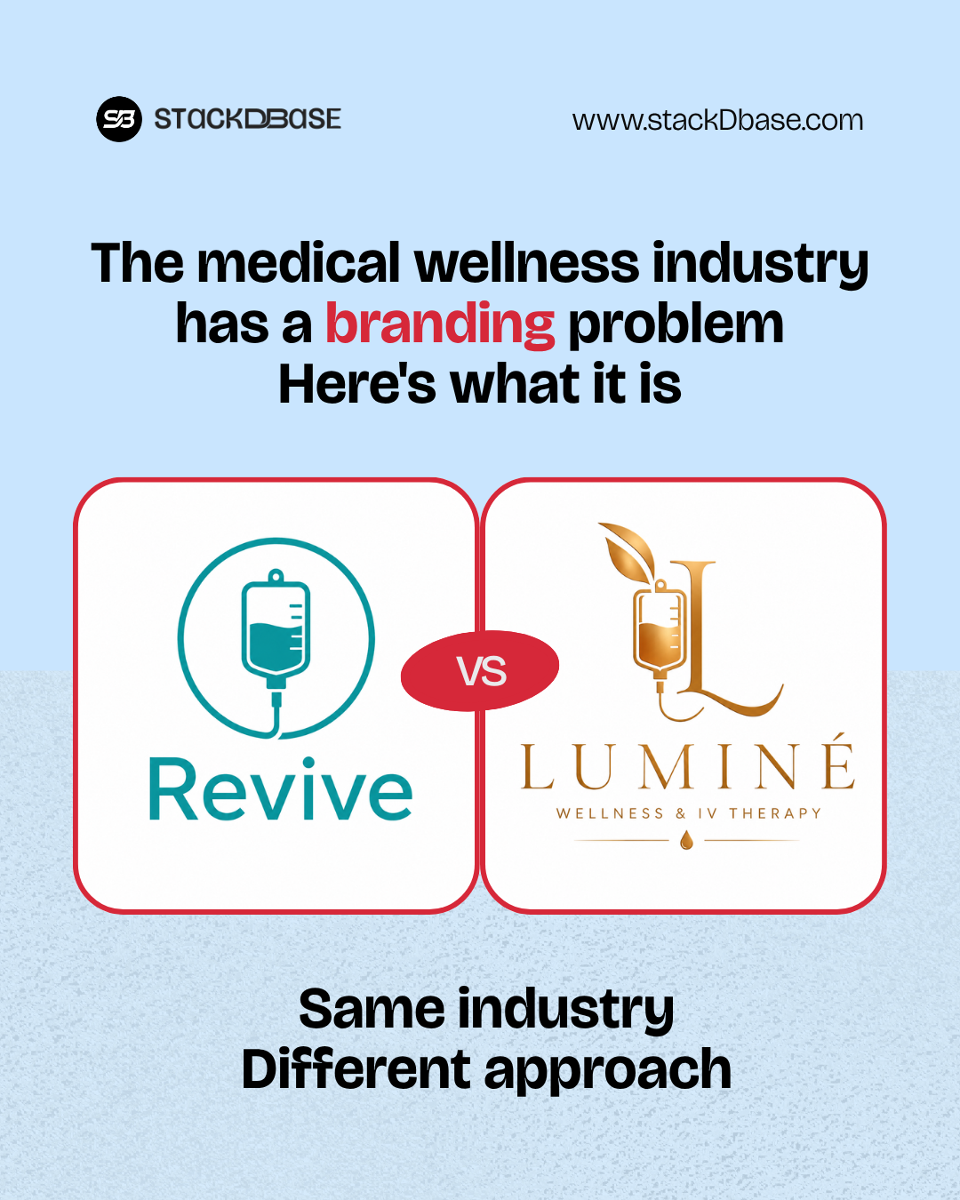
I looked at 10 IV drip clinic websites this week. It was like looking at the same site 10 times. Teal, white, a drip icon, the word "revive." Maybe a stock photo of someone smiling with an IV in their arm. It's all the same.
Now, let me be clear: Teal isn't a bad choice. It's a calming, trustworthy color. There's a reason it's popular in healthcare. Blue tones evoke trust. Teal specifically bridges the gap between professional and approachable, it's a safe choice.
But that's exactly the problem. It's become the default. And when everyone uses the same colors, fonts, and imagery, it stops meaning anything. It becomes noise. And in an industry built on trust and expertise, that visual sameness is a credibility killer.
Why This Matters
Medical wellness is a trust-based industry, patients are making decisions about their health, their appearance, their wellbeing. They need to feel safe, confident, and understood. If every clinic looks identical, how does a patient know who to trust? How do they choose? They default to price or location; or whichever one shows up first on Google. That's not a brand strategy, it's a commodity.
The Visual Sameness Problem
Color: The Teal Epidemic
Teal is calming, it's trustworthy. It says "we're professional and approachable." But when every wellness brand uses the exact same shade with the exact same white and grey supporting palette, it stops differentiating. It becomes the uniform. The lesson: Color choice matters. But using the same color as everyone else isn't a strategy. It's a default.
Imagery: The Stock Photo Trap
Smiling faces, water droplets, clean white backgrounds. It all feels generic. Stock photography says "we couldn't be bothered to show you who we really are." In a trust-based industry, that's dangerous. The lesson: Real photos, real people, real spaces. That's what builds connection.
Copy: The Jargon Problem
"Rejuvenate your wellness." "Revive your energy." "Restore your vitality." These phrases have lost all meaning. They're filler, they say nothing. The lesson: Write like you talk. Be specific. Describe what you actually do.
Logos: The Drip Icon
The drip icon is the wellness version of the coffee cup on a coffee shop logo. It's obvious. It's everywhere. It's meaningless. The lesson: Your logo should tell a story. Not just show an icon.
How to Stand Out Without Losing Professional Edge
1. Use Color Strategically, Not Predictably
Teal can work, but use it differently. Pair it with unexpected colors, use it sparingly as an accent, or choose a different shade entirely. The goal isn't to avoid teal, it's to avoid looking like everyone else.
2. Invest in Real Photography
Hire a photographer. Show your actual space, your actual staff, your actual patients (with permission). Real photos build trust in ways stock photos never can.
3. Write Like You Talk
Ditch the jargon. Write like a human talking to another human. Be specific, be honest, be helpful.
4. Showcase Your Unique Approach
What makes you different? Is it your medical director's expertise? Your personalized protocols? Your luxury setting? Put that front and center.
5. Build a Brand That Feels Like You
Don't build a brand that looks like the industry standard. Build a brand that looks like you. What are your values? Your personality? Your vibe? Let that guide your design.
6. Lead with Trust Signals
Your brand should communicate expertise, certifications, accreditations, years of experience, professional affiliations. These are credibility signals that generic design can't provide.
7. Be Specific About What You Do
Don't say "hydration therapy," say "IV fluids with added vitamins tailored to your specific needs." Specificity builds trust.
Examples of What Works
Instead of "Revive your energy," try: "We help you feel like yourself again. No brain fog, no fatigue, just you." Instead of "Hydration therapy for wellness," try: "IV fluids with B12, vitamin C, and magnesium. Tailored to what your body actually needs." Instead of generic stock photos, try: Real photos of your clinic, your team, your actual patients (with their consent).
What to Do Next
Step 1: Audit Your Brand
Are you using the same colors as everyone else? Is your imagery generic? Does your copy sound like everyone else's?
Step 2: Find Your Differentiator
What do you do differently? What makes you unique? Lead with that.
Step 3: Build a Brand That Stands Out
Don't be the 11th teal wellness brand, be the one that looks and feels different.
Conclusion
Teal isn't the enemy, but it's become the uniform of the wellness industry. And when everyone wears the same uniform, nobody stands out. At StackDbase, we help wellness brands build trust through design. With us, no brand looks the same. Ready to build a wellness brand that actually stands out? Let's talk.
More reading
Other notes from the studio.
Website
Why Your Website Isn't a Project, It's a Product
Most people treat their website like a project. You build it, you launch it, you move on. But a website is a product. Here's how to shift your mindset.
Marketing
Why Asking for a Review Is the Most Underrated Marketing Tactic
A good review is worth 10 paid ads. It's social proof that works while you sleep. Yet most brands don't ask. Here's how to start.