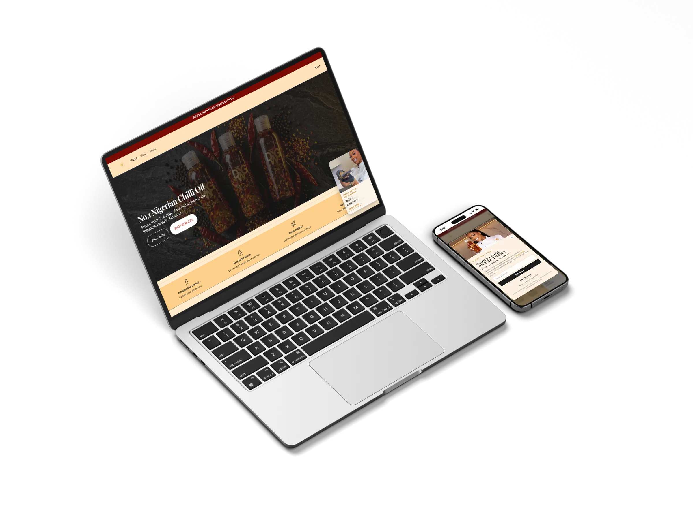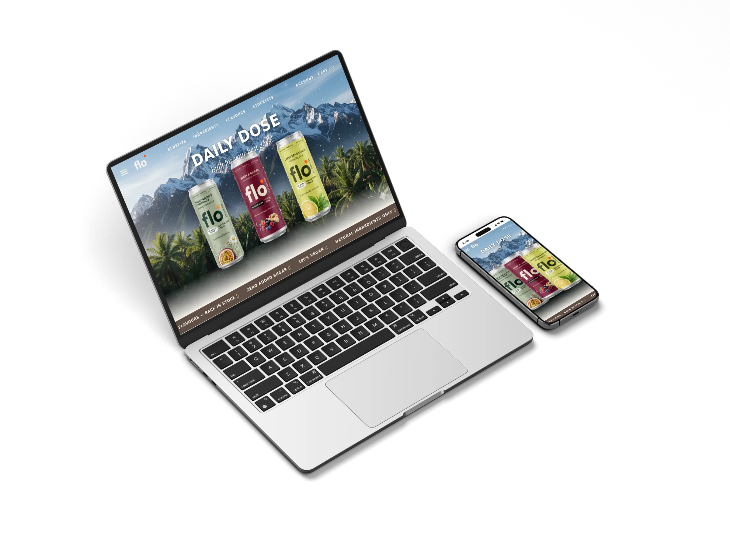
Functional drinks · Shopify Hydrogen
A headless Shopify storefront for a three-SKU functional drink brand. Three themed sub-brands, one Hydrogen architecture, agency-grade design.
Visit the live siteBrand
Flo Drinks
Industry
Functional Wellness
Platform
Shopify Hydrogen
Delivered
2026
Three flavours. One job each. Nothing decorative, nothing artificial, nothing you have to apologise for.
— Flo's mission, written into the homepage.
By the numbers
3 SKUs
themed sub-brands
Headless
Hydrogen on Oxygen
Editorial
agency-grade design system
The brand
Flo Drinks is a British functional drink brand built around three states — focus, recovery, calm. Each can a different ingredient stack, each meant for a different moment of the day. Functional wellness without the protein-shake aesthetic.
Three flavours, three colour worlds, one brand. The storefront had to hold all of them — a homepage that pitches the range, three product pages that each own their colour and ingredient story, a stockists map, a checkout that converts. Every screen had to feel like Flo, not a Shopify theme adapted to Flo.
A headless Shopify storefront built on Hydrogen with React Router 7 and Tailwind v4, deployed to Shopify Oxygen. Each product page is themed via Shopify metafields — flavour colour, ingredient cards, batch number, mood line all come from the admin so future SKUs drop in without code. Cinematic lifestyle photography per can. A stockists map driven by Leaflet (SSR-safe). Custom cart with notify-me on out-of-stock. Bold grotesque typography across the brand.
The work
Built once. Beautiful on every screen.
Mobile-first foundation, agency polish on desktop. The same Flo voice — bold grotesque type, cinematic backdrops, three cans — across every viewport.
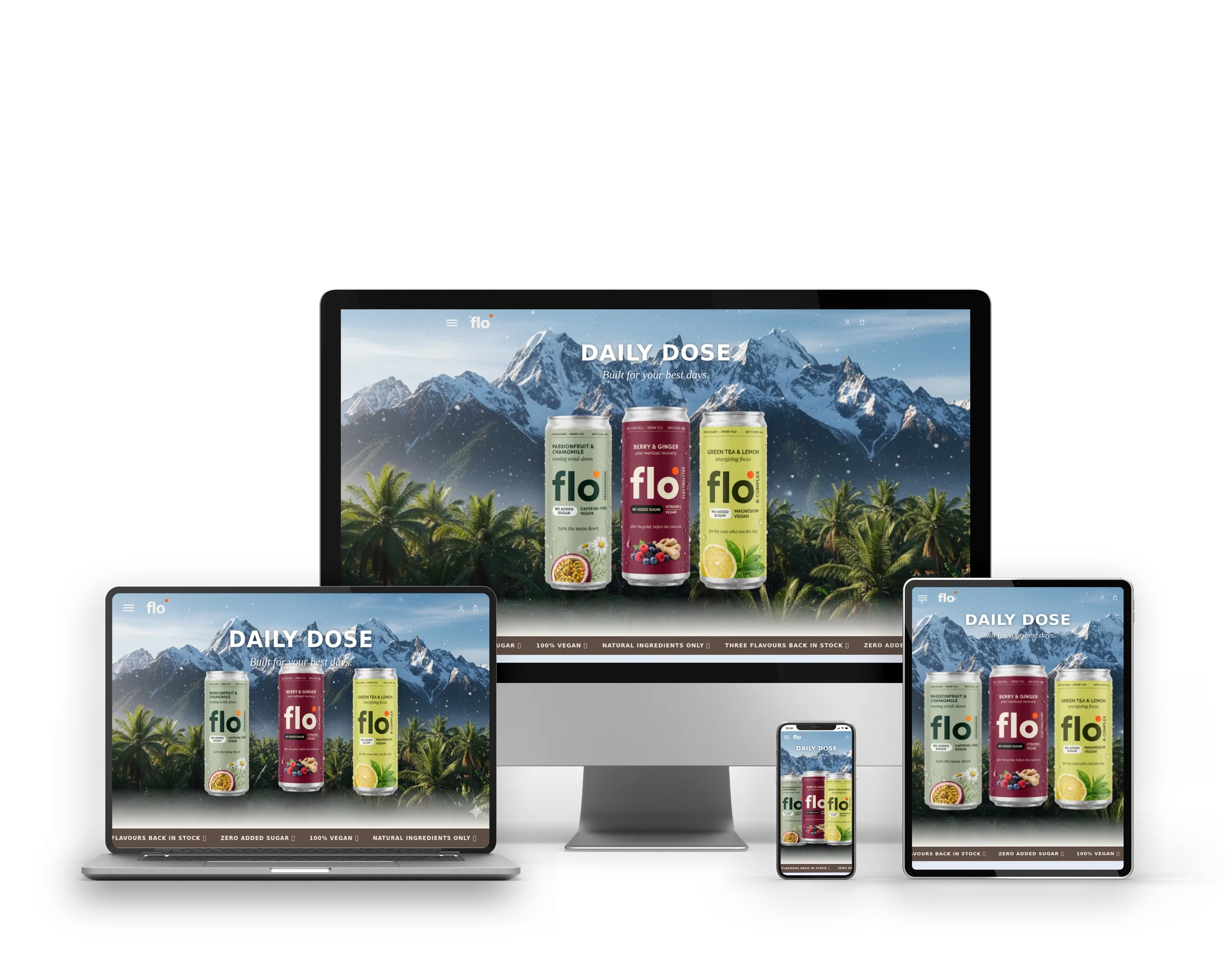
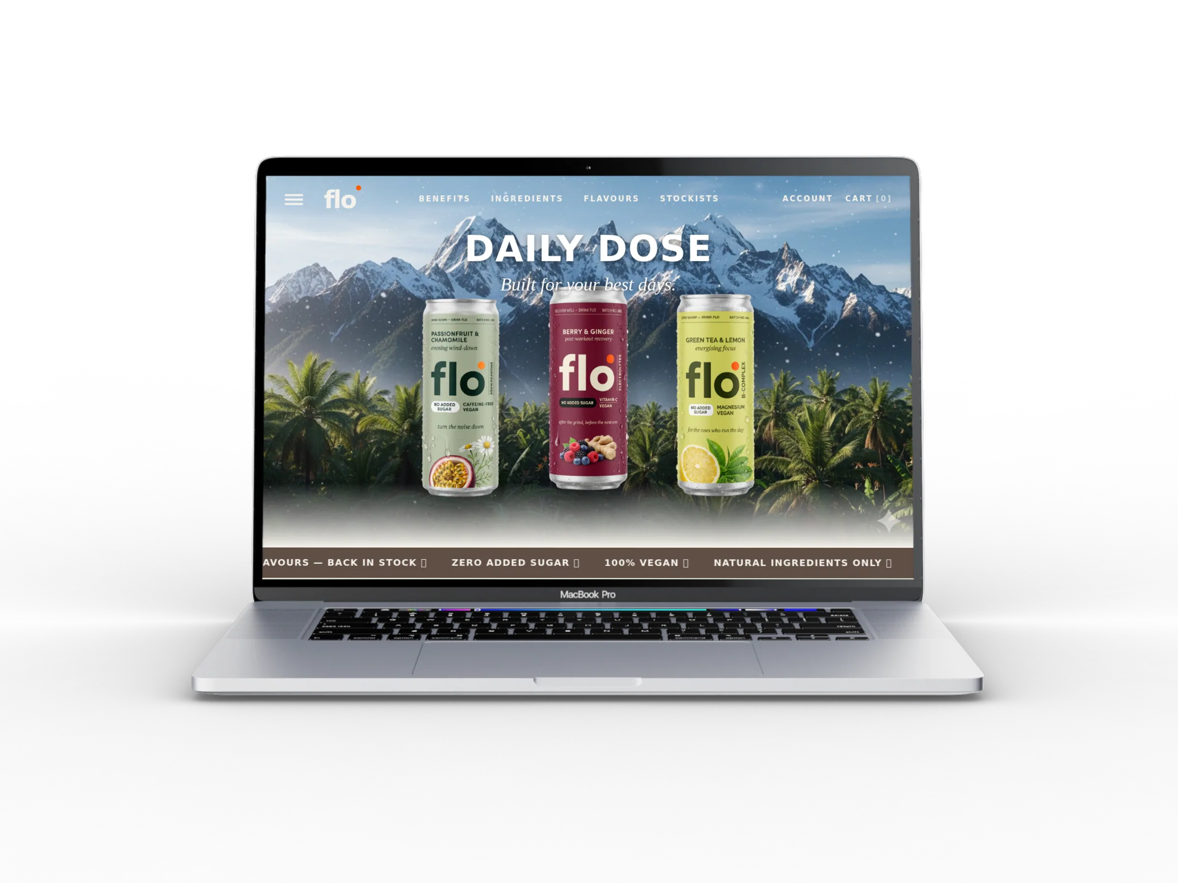
Daily dose. Built for your best days.
Homepage pitches the entire range in three seconds. Mountain backdrop, three flavours abreast, headline that earns the scroll.
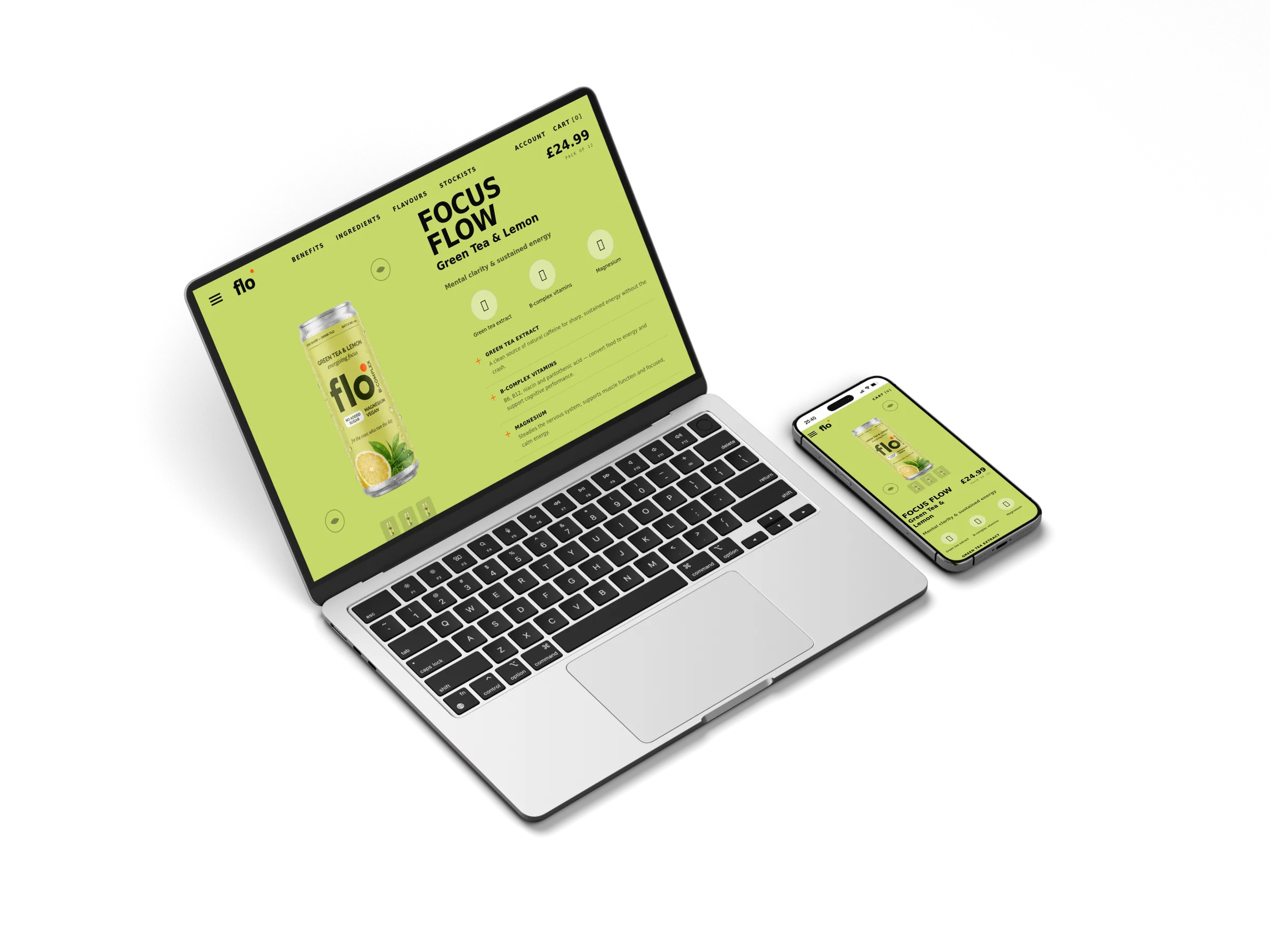
Focus Flow — the energising one.
Themed product page in citrus green. Mental clarity and sustained energy framed as a daily routine, not a stim hit. Ingredient pillars, pack picker, ingredients drawer.
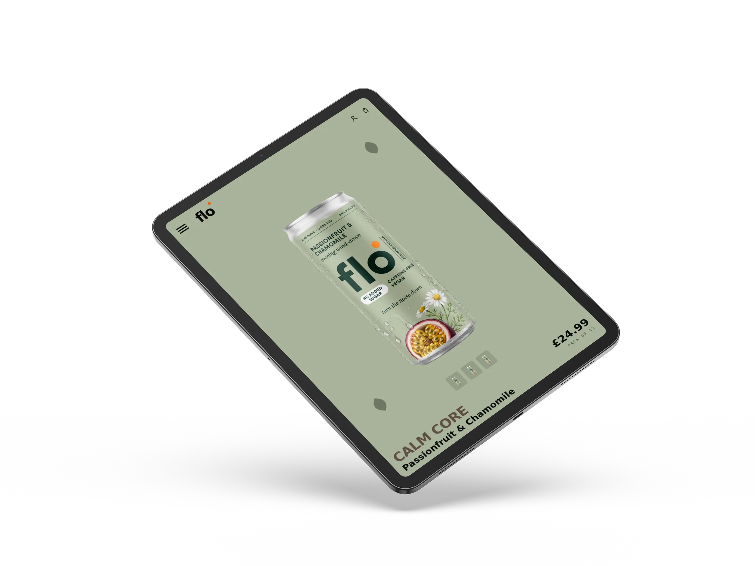
Calm Core — the wind-down one.
Sage palette, gentler rhythm, same three-section ingredient pillar. Stress relief framed clinically — ashwagandha, magnesium glycinate, chamomile — not mystically.
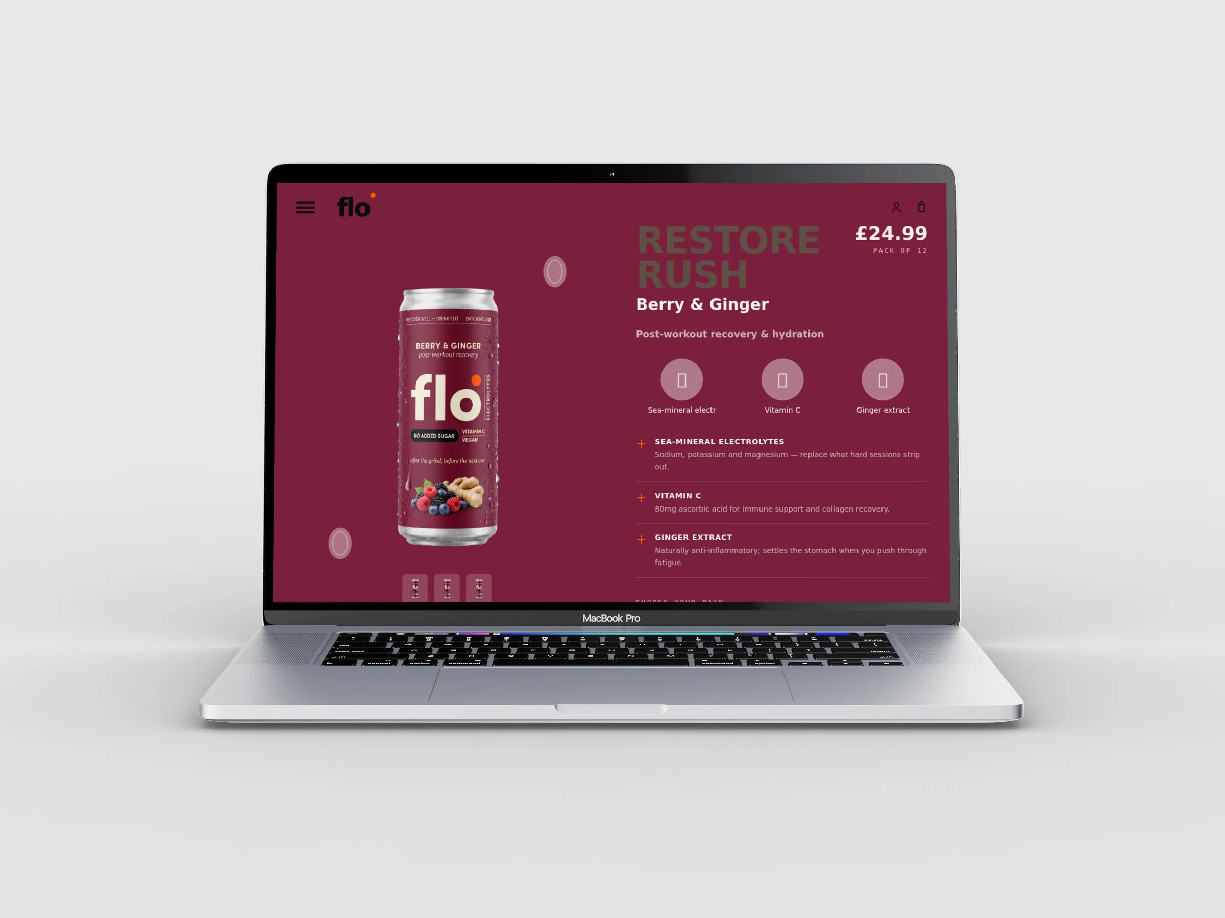
Restore Rush — the recovery one.
Deep berry colour world. Electrolytes, vitamin C and ginger framed as the bridge between the grind and the next one. Same shell, completely different mood.
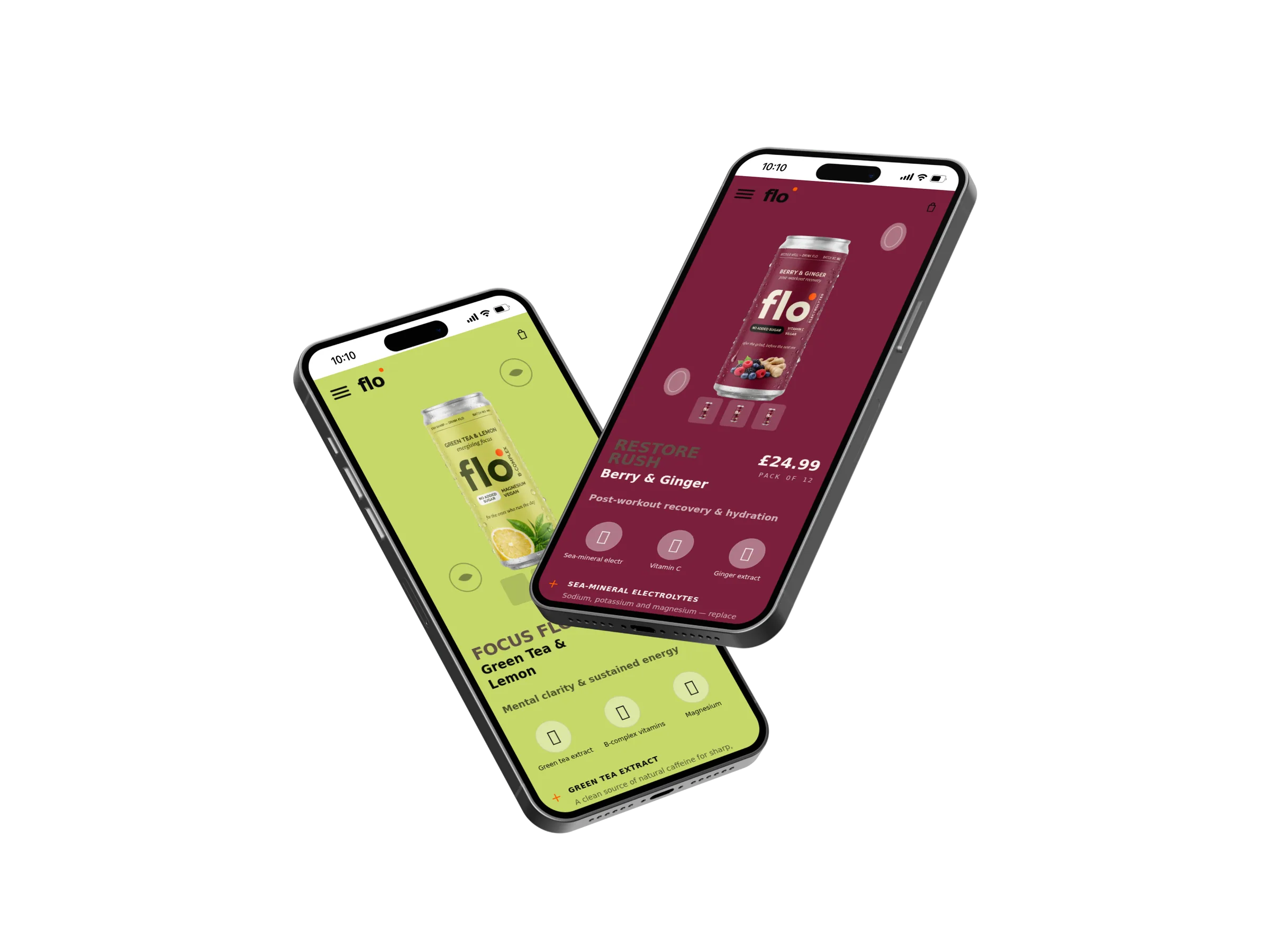
Mobile commerce that feels editorial.
Where most of the visits actually happen. Themed colour, big can, ingredient pills and pack picker all readable above the fold without crowding.
What we delivered
Strategy, design, copy and setup. One team, one timeline, one scope.
More work